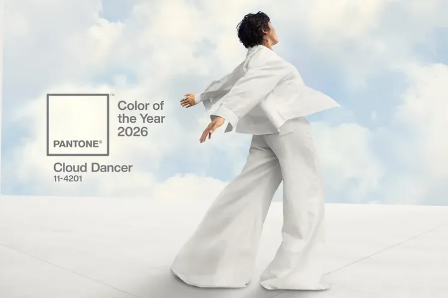
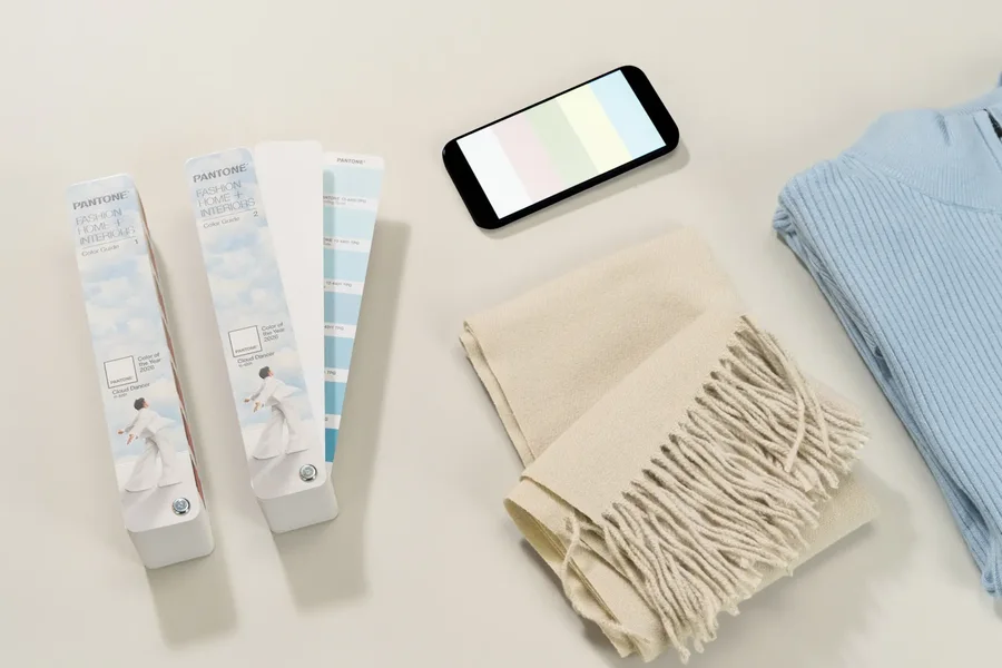
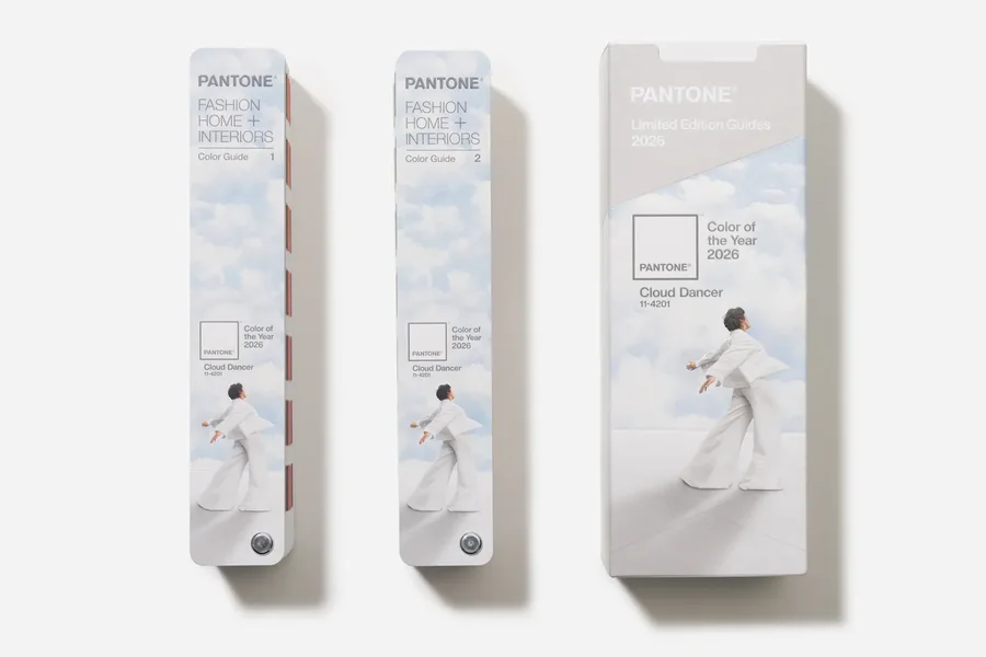
Pantone has announced its Color of the Year for 2026, and the selection has sparked a huge online debate . On December 4, the company unveiled the shade it says represents the coming year: Cloud Dancer , a shade of white. According to Pantone, the company that creates and standards colors used globally, the color symbolizes “a calming influence in a society that is rediscovering the value of quiet reflection.”
This is the first time Pantone has chosen a shade of white as the Color of the Year.
They describe Cloud Dancer as a soft white, filled with calm, which leads to relaxation and concentration, allowing the mind to wander freely and creativity to breathe.
On their platform, Pantone adds that in a world where color has become a form of personal expression, this hue has the ability to adapt, harmonize, and create contrast. It lends a sense of airy lightness to any environment or product, whether as a single element or combined with other colors.
How is the Color of the Year selected?
Pantone relies on a global team of color experts who analyze influences from film, television, art, fashion, design trends, emerging technologies, new materials, social media, and major world events. According to the company, each cultural element of the year can influence the color selection, and the weight of each varies from year to year. Laurie Pressman, the company's vice president, has previously said that despite the differing views, the institute's members always reach a consensus.
Why has there been such a strong reaction?
Public reaction has been mixed, with many critics calling the choice creatively and culturally inappropriate. Some designers and social media users have said that choosing a shade of white “in this social and political climate” is inappropriate and shows a lack of cultural sensitivity. Many people have called the choice “ignorant,” “detached from artistic reality,” and “lacking creativity.”

Others argued that in a period when color is used to express culture, diversity, emotion, and innovation, choosing a pure white is wrong in tone and at worst carries problematic connotations.
There have also been more practical debates: some users pointed out that white, according to traditional artistic perception, "is not considered a color," seeing this as a poor creative choice.
Has Pantone responded to the criticism?
After the color was announced, Laurie Pressman said that skin tone considerations “played no role” in the choice. She recalled that the 2024 and 2025 colors were also criticized for the same reason, even though Pantone had not intended any such reference.
Pantone Color Institute executive director Leatrice Eiseman responded to criticism of the lack of creativity by emphasizing that it was not a choice “out of laziness.” According to her, the hue is meant to represent a “blank canvas,” a new space for new ideas, new possibilities, and new ways of thinking.