For years, street fashion has gravitated towards neutral tones and muted luxury. Minimalism, beige, gray, white, and black; they all have their place and are undeniably elegant. But when did we become so afraid of color?
Wearing a bold hue doesn't mean you have to lose style. In fact, some of this season's freshest combinations come from color palettes that no one would think of together.
And no, there are no more fashion “rules”: pink and red can go together; navy blue and black are fantastic if combined properly; and colors that were once considered “conflict” are now style signals. Below, find 5 color combinations that will refresh your wardrobe this fall.
1. Soft yellow + cobalt blue
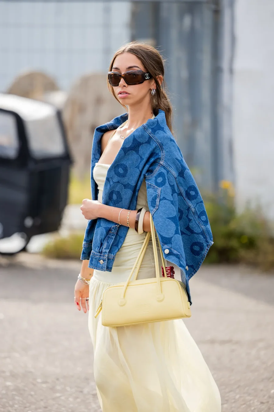
The combination that reminds you of sunlight and the night sky. Pastel yellow is still trending, even when the temperatures drop. Pair it with a deep blue jacket to create contrast and autumn elegance.
2. Pistachio green + salmon pink
Pistachio is the queen of this year. Combine it with a soft pink tone that reminds you of sun-kissed skin.
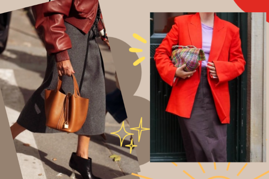
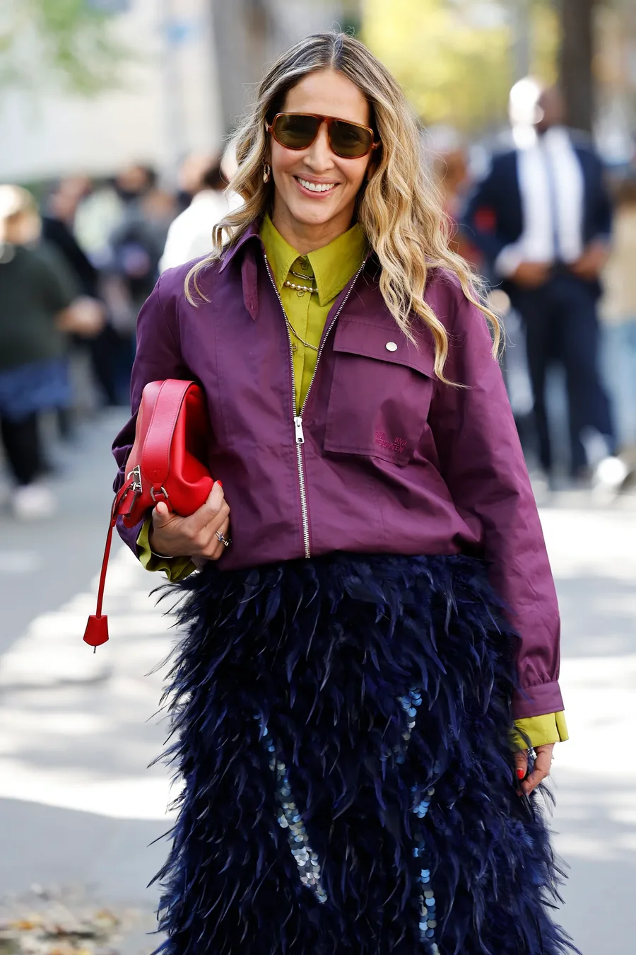
3. Red to orange + soft purple
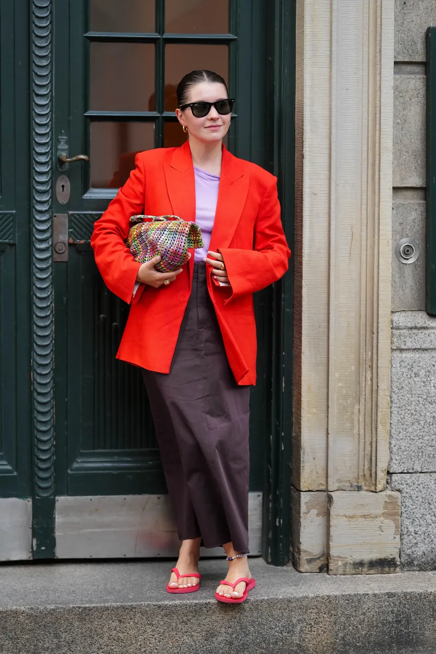
Pastel purple looks like an invitation to spring, but when combined with bright red, it turns into a bold yet delicate look. Ideal for an after-work date or dinner with friends.
4. Gray + caramel
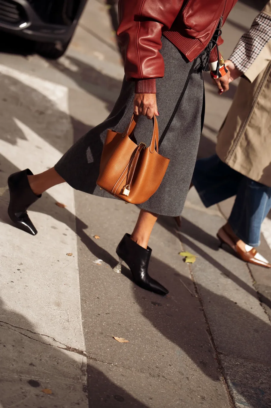
Why not mix them up? These two colors create a super elegant and sophisticated effect when worn together. It's a combination that says "I'm a lady" without saying it out loud.
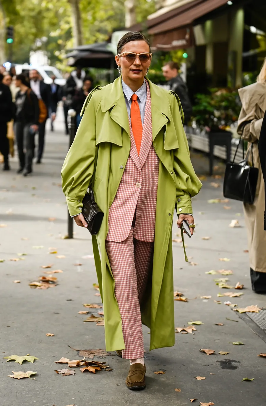
5. Cherry red + Olive green
No, we're not talking about Christmas atmosphere! When the right shades are chosen, cherry and olive, this color duo becomes more "French fashion" than "holiday." And when you add gemstone shades like deep blue or dark purple? Magical.
-

-
-
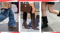
The boots you should wear this fall, according to your zodiac sign
October 16, 18:05 -