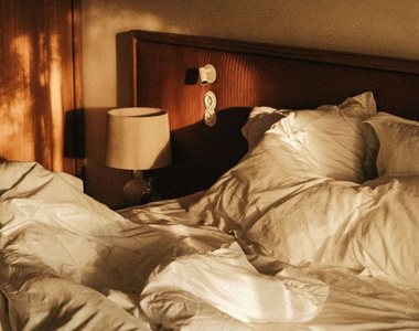
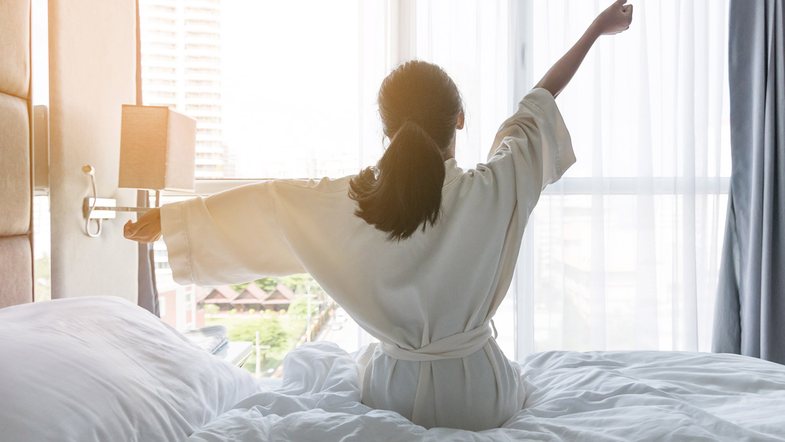
How many times have you said "lights out" you know it's time to sleep. We know that keeping the lights on seriously harms the quality of sleep, but we didn't know that the color of the walls with which you painted the room also affects the quality of a good sleep. Being surrounded by the wrong colors affects your mood and directly the quality of your sleep. Here are the three colors you should choose to enjoy a super sleep.
the blue colour
Blue is the best color for your bedroom, but not the bold one. Not only is it a light shade, but blue tones tend to have more calming effects on the brain, as shown in a study five years ago by the US National Center for Biotechnology.
Green
Green can remind you of nature, which can bring about a relaxing state. For many people, green is a harmonizing and refreshing color at the same time.
Yellow
This color gives the feeling of happiness as soon as you wake up from sleep. It does not encourage you to sleep often, but due to the feeling of joy it conveys, yellow should be a choice for the walls of your room.
The worst room colors that affect your sleep
Too bright colors should be avoided in bedrooms. These include red and strong orange, which are considered energetic hues. Bright pinks and purples or neon colors can be stimulating when you're lying down to sleep. Dark gray and brown colors are not recommended because they can evoke feelings of insecurity.
If you are thinking of painting your bedroom, be careful to choose shades that are not strong.