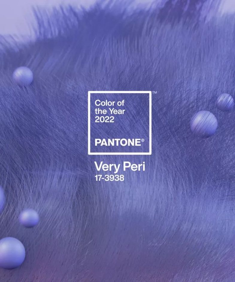
Every year, Pantone, the global company that has set a standard in the design industry publishes the color that will be the highlight of the year. So each year is represented by a color and what do we have for 2022?
'Very Peri'- a shade between purple, lilac and blue, is what best represents 2022 and you will see it almost everywhere starting from now! Why exactly this color?
Hoping for change and renewal, Pantone chose North Perry to remind us to trust every opportunity that will come in the future.
Veri Peri, një simbol i tranzicionit nëpër të cilin po kalojmë globalisht, një nuancë që ilustron larminë e jetës moderne dhe se si trendet e ngjyrave në botën dixhitale po manifestohen në botën fizike dhe anasjelltas.
Pantone është një kompani që operon prej vitit 1950 në Neë Jersey, e njohur për sistemin e saj të kombinimit Pantone (PMS), që prodhon ngjyra që përdoren në një sërë industrish, veçanërisht në dizajnin grafik dhe në industrinë e modës, në formë fizike dhe dixhitale.
Si vendoset se kush është ngjyra e vitit?
Procesi i përzgjedhjes së ngjyrës është rezultat i analizës së trendit. Pantone thotë se ekspertët e ngjyrave vëzhgojnë dhe monitorojnë trendet në të gjithë botën e më tej arrijnë në kombinimin më të përshtatshëm të tyre.
Once the selection is done, the color of the year turns into a trend, especially in the digital world, affecting various industries like marketing, design, fashion. Therefore, we reiterate again that 'North Peri' will appear everywhere before your eyes throughout this year.
Source: Homes & Gardens